
Compare this coloring to some of the raw file shots in this Album!
Color in this film is very key to the way you as a viewer are meant to experience it. That's of course true of every film, but Summit in particular because I wanted the film to start out very vibrant and Hollywood-Slasher-esque, then make a slow but dramatic shift in the color tone as the narrative turns away from the formula the viewer is probably expecting and becomes something a little deeper and a lot more 'indie.' I'm obviously being kind of spoilery here, but if you've been following this film from the beginning as many of you have then you've already been spoiled quite a bit. I will, however, avoid showing you some shots in the comparisons I'm about to do because I still want the film to surprise and intrigue you visually when you watch it for the first time!
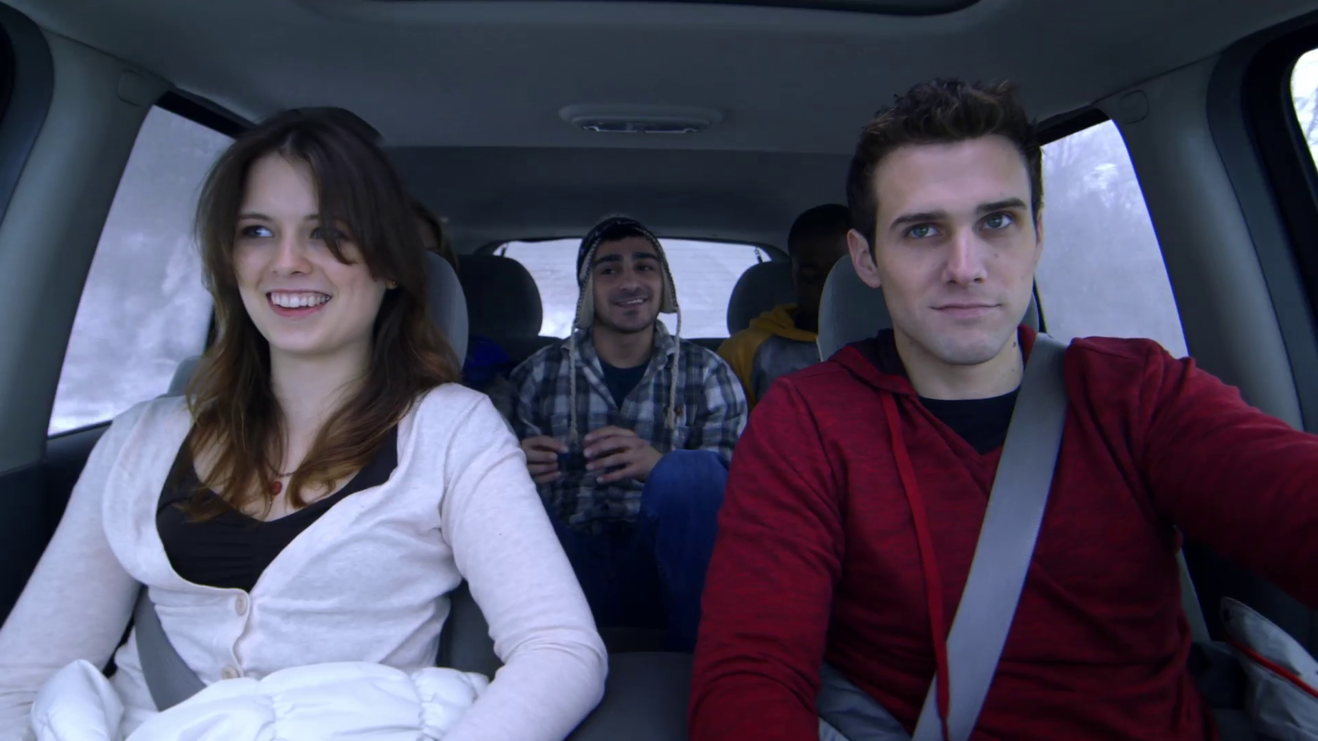
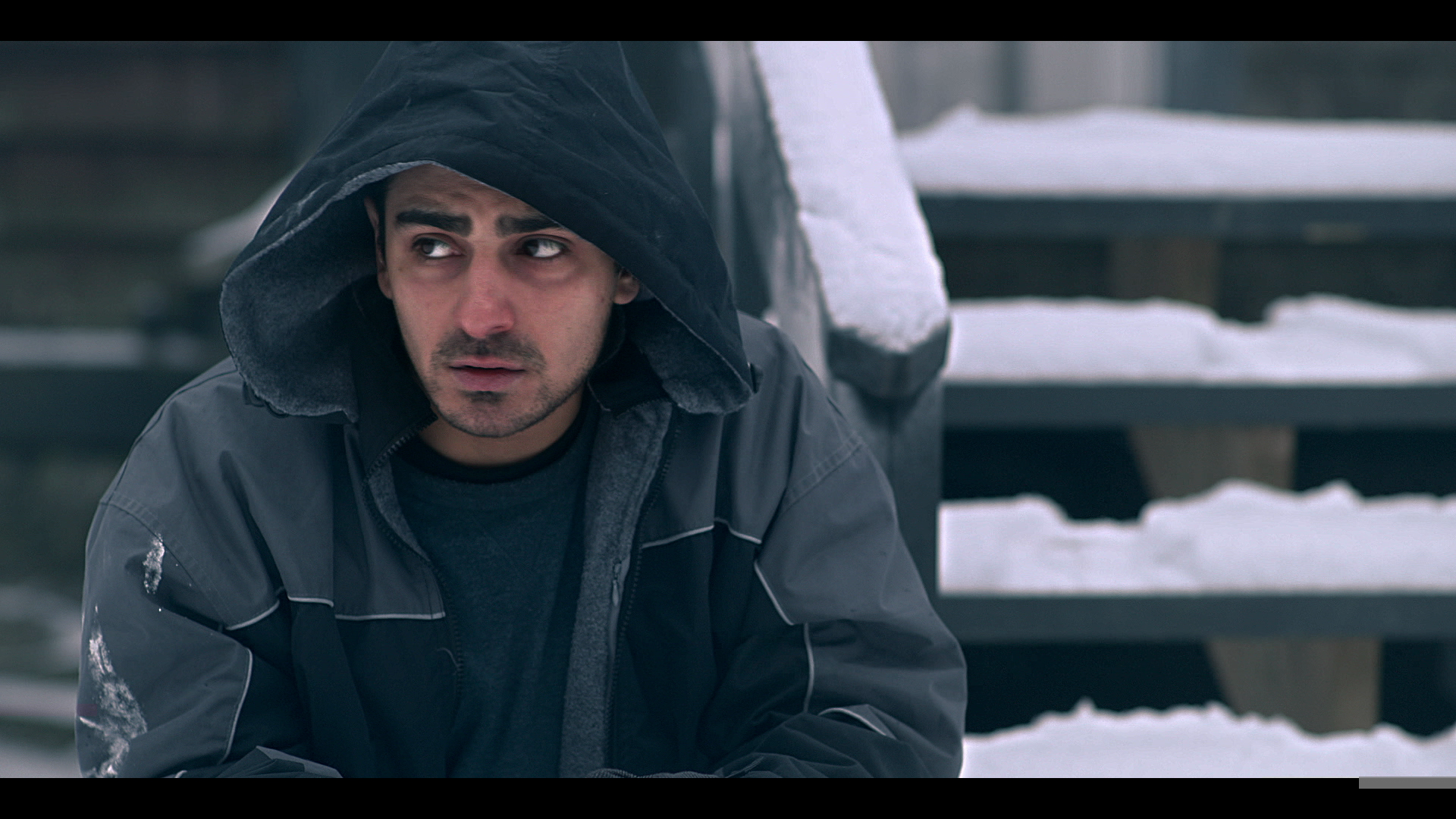
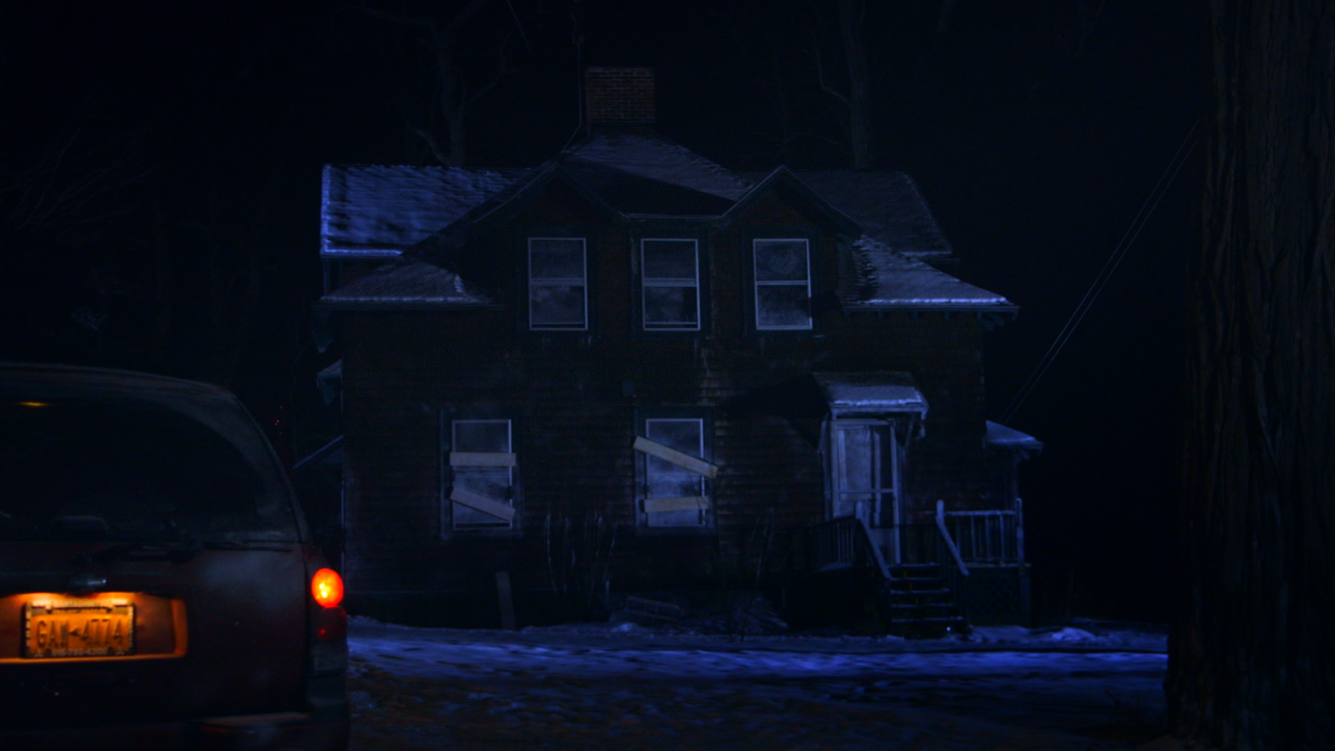
One of the most interesting things about our Teaser is that I had Anna, our colorist, color it separately before completing the film rather than coloring the film and pulling the shots from it for the teaser. I did this because I wanted the teaser itself to reflect this progression from a warmer, more vibrant Hollywood look to a colder, more intense look the way the film flows. However, the shots from the teaser may not actually be in the order they appear in the film and are not all pulled from the same emotional/narrative moment like I want you to think when watching that teaser. So, what I've done is pulled Stills from all the shots in the teaser and pulled the matching Stills from the original raw, uncolored cut for comparison.

Original

Teaser

Original

Teaser

Original

Teaser

Original

Teaser

Original

Teaser

Original

Teaser

Original
Teaser

Original

Teaser

Original

Teaser

Original

Teaser
We shoot images in a cinematic mode on our cameras that flattens the image. The information is all still there for the colors, but shooting it flat allows the colors to be pushed in various ways in post-production.
Now seeing some of those same stills from the actual cut of the film should interest you because you can see how the color temperature is much colder in the film itself compared to the teaser.

Actual Film
Actual Film

Actual Film

Actual Film

Actual Film
The same footage could have many different looks, both subtle and drastic. That's the beauty of well lit shots and good color grading (or rather, that's the beauty of my DP John and Colorist Anna).
I don't want to show all the shots from the teaser in their actual film versions because doing so would maybe allow you to place them chronologically within the film and spoil some fun for yourself. But I will definitely include before and after Stills with commentary as part of a DVD or Digital Download Special Feature.

Actual Film
One interesting point I will bring up, though, is the fact that I found the color correction process to be so interesting because of the variety of choices I was given. There were times where I was torn between the most aesthetically pleasing image and the one that most represented where we were at emotionally in the story. Take for instance this shot. If you compare this to the one from the teaser, it's arguably less flattering. The teaser version is a sharper, more striking image. It's more stylized. It's maybe more exciting and pleasing to look at. I believe it's definitely more eye catching. However, the coloring of the shot in the teaser does not work narratively for this particular moment within the actual film. Ultimately, it's about choosing what best elicits in the viewer what you're trying to say. It's about looking at the bigger picture of a scene and not at the shots or moments individually. Having never made such a long film before, especially one where I chose to make the color tone(s) such an integral part of the viewer experience, I was not expecting to have so many subtle choices with the color. It was fun to do scene by scene but also required me to step back and think of the film as a whole. I had to try to avoid falling in love with any particular look of any particular shot (like the one above in its Teaser version) because, when you come down to it, it's all about what most effectively tells the story. This is something I've definitely learned more through running IndieWorks because I often see films where I think the filmmaker(s) chose the most beautiful look for shots, but maybe not the most viscerally effective. Finding that balance is key, I believe.
Lastly, I know I haven't released my Shooting Summit "journal" yet (wanted to take a break from it to edit before releasing to the public, as well as time it for festival buzz), but you will eventually be able to read it and see that I spent the second half of production obsessing in my head about whether or not one key scene would come together in post-production or completely break the film. That key scene was a daylight scene that involved all 5 characters and a hefty amount of coverage throughout the scene. The problem was that we had a beautiful, bright sunny day out, which is film, especially indie film, hell. It made getting consistent shots impossible because the sun kept moving, creating shadows everywhere. I feared that when cut all together, the lighting would be ridiculously inconsistent and wondered if it would completely pull viewers out of the emotions of the scene. A year later, while writing Shooting Summit, I still did not know the answer to that question because I was still looking for a Colorist. It was good that I didn't know because it allowed me to stay in that headspace for writing. However, I'm very pleased to say that, although I can not prove it to you by showing you shots or footage just yet, it did work out in the end. Anna made it all look unbelievably cohesive. I'm so grateful to her for that and to John for working with the light despite his preference not to and making sure it could all come together in the end. And while I'm at it, I thank Peter, Charlotte, Erin and Adnan, who all helped with lighting & camera on set that day and all the days. But since I'm talking color for this post, I'd like to plug Waffle-Media, the company Anna runs for her post-production services. I definitely recommend hiring her/them.
As for the rest of the film, the visual effects should be done by the end of this month. That's very exciting! After the effects, title design and animation will be the final visual step for the film. We're still working on a logo redesign to make it a little more unique and tailored to how it will appear within the film. Our score is a bit of a hold up because I keep going back and forth with Colin, our composer/mixer. But he's doing an excellent job and I believe he has a good handle on what I want now. So, I anticipate having the score and sound mix done by the end of June, which would put the entire film in the can in July. That's perfect because our first festival deadline is in August!
Then, it's months and months of waiting to hear back from them. So much work has gone into this film in the last year; it's going to be crazy getting to the point where it's literally just waiting. But I can't wait for it. It'll be such a relief. Even if it is a series of rejections, I'll know that we finished the film, put it out there and are that much closer to being able to share it with all of you. So please stay tuned for more updates. We've got some cool stuff on the way, like the reboot of our website, some new 'Questions with the Cast' videos we shot a couple months back, the release of Shooting Summit and even some sneak peeks at scenes from the film! This Summer and Fall will be full of exciting content and news.
Thanks for all the patience, support and faith in me & my team,
Christina
Read my last post about the process of making our Kickstarter Trailer >