Seed&Spark Crowdfunding Campaign Launch!

We're crowdfunding for 2 new short films by the creators of  (Christina Raia & Kelsey Rauber)! Watch our pitch below & please join us in making these films by supporting on Seed&Spark! 

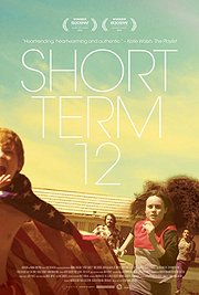
#StrictlyIndie Film Views: "Short Term 12"

Untitled.png

The terms “Hipster film” and “Melodrama” are some that are thrown around almost too often these days; both of which could be used to sadly categorize a film like Short Term 12. In my opinion, a melodrama is a work in which performances and direction are far more exaggerated than the subject matter calls for, and as a result, comes off as inorganic. Destin Cretton’s film doesn’t fall under that umbrella. Short Term 12 doesn’t simply pull heart strings to get an emotional response. It explores the amount of courage, patience and unrestrained empathy that is needed to let someone in after a life of abuse.

The film centers around Grace (Brie Larson), a strong-willed woman with an unrelenting vocation for helping the children she works with at a home for at-risk-teens. Her day to day is rather procedural (filled with level drops for cussing and random room checks) until a girl named Jayden (Kaitlyn Dever) is brought in. Jayden is dropped in the group home as a favor to her father and Grace soon realizes the distinct similarities between them. As Grace uncovers the truth behind Jayden’s home life, her own past is brought to the forefront, testing her relationships outside of the home.

Short Term 12 is also just as much a love story as it is an unsettling drama. Grace’s boyfriend and co-worker at the facility, Mason (John Gallagher Jr.), is hellbent on getting Grace to allow him inside her head. He believes she is the weirdest, most beautiful person he has ever met in his entire life, and Brie Larson’s performance won’t have you feeling any other way. In what is undoubtedly Larson’s most challenging and rewarding role yet, she delivers exactly what is needed to pull you in. 

With other notably resonant performances from Keith Stanfield and the rest of this vibrant cast, Short Term 12 is one of the most heartwarming and heart-wrenching films of 2013. It is now available for instant stream on Netflix.

eview

Review by Ryan Kramer.

'Juice It' Teaser

We premiere the Teaser Trailer for Christina's latest short film "Juice it." The film is 10 minutes of absurd fun! We can't wait to share it with you but can't do so until we hear back from festivals. In the meantime, enjoy the Teaser!


A young couple attempt a 7 day juice cleanse but quickly realize it's much more difficult than they anticipated as they pass the first 24 hours. 

SUMMIT Color Correction

On April 9th, color correction for Summit was finished! If you're following us on Facebook & Twitter, you were notified right away. But I waited to do this post until now so that I would have the high res colored files to show you some shots. 

Compare this coloring to some of the raw file shots in this Album!

Compare this coloring to some of the raw file shots in this Album!

Color in this film is very key to the way you as a viewer are meant to experience it. That's of course true of every film, but Summit in particular because I wanted the film to start out very vibrant and Hollywood-Slasher-esque, then make a slow but dramatic shift in the color tone as the narrative turns away from the formula the viewer is probably expecting and becomes something a little deeper and a lot more 'indie.' I'm obviously being kind of spoilery here, but if you've been following this film from the beginning as many of you have then you've already been spoiled quite a bit. I will, however, avoid showing you some shots in the comparisons I'm about to do because I still want the film to surprise and intrigue you visually when you watch it for the first time! 

One of the most interesting things about our Teaser is that I had Anna, our colorist, color it separately before completing the film rather than coloring the film and pulling the shots from it for the teaser. I did this because I wanted the teaser itself to reflect this progression from a warmer, more vibrant Hollywood look to a colder, more intense look the way the film flows. However, the shots from the teaser may not actually be in the order they appear in the film and are not all pulled from the same emotional/narrative moment like I want you to think when watching that teaser. So, what I've done is pulled Stills from all the shots in the teaser and pulled the matching Stills from the original raw, uncolored cut for comparison.

Original

Original

Teaser

Teaser

Original

Original

Teaser

Teaser

Original

Original

Teaser

Teaser

Original

Original

Teaser

Teaser

Original

Original

Teaser

Teaser

Original

Original

Teaser

Teaser

Original

Original

Teaser

Teaser

Original

Original

Teaser

Teaser

Original

Original

Teaser

Teaser

Original

Original

Teaser

Teaser

We shoot images in a cinematic mode on our cameras that flattens the image. The information is all still there for the colors, but shooting it flat allows the colors to be pushed in various ways in post-production.

Now seeing some of those same stills from the actual cut of the film should interest you because you can see how the color temperature is much colder in the film itself compared to the teaser.

Actual Film

Actual Film

Actual Film

Actual Film

Actual Film

Actual Film

Actual Film

Actual Film

Actual Film

Actual Film

The same footage could have many different looks, both subtle and drastic. That's the beauty of well lit shots and good color grading (or rather, that's the beauty of my DP John and Colorist Anna).

I don't want to show all the shots from the teaser in their actual film versions because doing so would maybe allow you to place them chronologically within the film and spoil some fun for yourself. But I will definitely include before and after Stills with commentary as part of a DVD or Digital Download Special Feature. 


Actual Film

Actual Film

One interesting point I will bring up, though, is the fact that I found the color correction process to be so interesting because of the variety of choices I was given. There were times where I was torn between the most aesthetically pleasing image and the one that most represented where we were at emotionally in the story. Take for instance this shot. If you compare this to the one from the teaser, it's arguably less flattering. The teaser version is a sharper, more striking image. It's more stylized. It's maybe more exciting and pleasing to look at. I believe it's definitely more eye catching. However, the coloring of the shot in the teaser does not work narratively for this particular moment within the actual film. Ultimately, it's about choosing what best elicits in the viewer what you're trying to say. It's about looking at the bigger picture of a scene and not at the shots or moments individually. Having never made such a long film before, especially one where I chose to make the color tone(s) such an integral part of the viewer experience, I was not expecting to have so many subtle choices with the color. It was fun to do scene by scene but also required me to step back and think of the film as a whole. I had to try to avoid falling in love with any particular look of any particular shot (like the one above in its Teaser version) because, when you come down to it, it's all about what most effectively tells the story. This is something I've definitely learned more through running IndieWorks because I often see films where I think the filmmaker(s) chose the most beautiful look for shots, but maybe not the most viscerally effective. Finding that balance is key, I believe. 

Lastly, I know I haven't released my Shooting Summit "journal" yet (wanted to take a break from it to edit before releasing to the public, as well as time it for festival buzz), but you will eventually be able to read it and see that I spent the second half of production obsessing in my head about whether or not one key scene would come together in post-production or completely break the film. That key scene was a daylight scene that involved all 5 characters and a hefty amount of coverage throughout the scene. The problem was that we had a beautiful, bright sunny day out, which is film, especially indie film, hell. It made getting consistent shots impossible because the sun kept moving, creating shadows everywhere. I feared that when cut all together, the lighting would be ridiculously inconsistent and wondered if it would completely pull viewers out of the emotions of the scene. A year later, while writing Shooting Summit, I still did not know the answer to that question because I was still looking for a Colorist. It was good that I didn't know because it allowed me to stay in that headspace for writing. However, I'm very pleased to say that, although I can not prove it to you by showing you shots or footage just yet, it did work out in the end. Anna made it all look unbelievably cohesive. I'm so grateful to her for that and to John for working with the light despite his preference not to and making sure it could all come together in the end. And while I'm at it, I thank Peter, Charlotte, Erin and Adnan, who all helped with lighting & camera on set that day and all the days. But since I'm talking color for this post, I'd like to plug Waffle-Media, the company Anna runs for her post-production services. I definitely recommend hiring her/them.  

As for the rest of the film, the visual effects should be done by the end of this month. That's very exciting! After the effects, title design and animation will be the final visual step for the film. We're still working on a logo redesign to make it a little more unique and tailored to how it will appear within the film. Our score is a bit of a hold up because I keep going back and forth with Colin, our composer/mixer. But he's doing an excellent job and I believe he has a good handle on what I want now. So, I anticipate having the score and sound mix done by the end of June, which would put the entire film in the can in July. That's perfect because our first festival deadline is in August!

Then, it's months and months of waiting to hear back from them. So much work has gone into this film in the last year; it's going to be crazy getting to the point where it's literally just waiting. But I can't wait for it. It'll be such a relief. Even if it is a series of rejections, I'll know that we finished the film, put it out there and are that much closer to being able to share it with all of you. So please stay tuned for more updates. We've got some cool stuff on the way, like the reboot of our website, some new 'Questions with the Cast' videos we shot a couple months back, the release of Shooting Summit and even some sneak peeks at scenes from the film! This Summer and Fall will be full of exciting content and news. 

Thanks for all the patience, support and faith in me & my team,

Christina 

Read my last post about the process of making our Kickstarter Trailer >

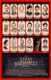
#StrictlyIndie Film Views: "Grand Budapest Hotel"

The Grand Budapest Hotel is a fresh breath of indie air into mainstream cinema. I have always been most fond of Wes Anderson’s Rushmore, as it was the first of his film’s I had ever seen, but I can easily say this is his masterpiece. The fact that he can take such a niche genre and never have a dull moment is a testament to Anderson as one of the most creative and impressive minds to hit the screen.

Budapest follows the adventures of M. Gustave (Ralph Fiennes) and his devoted lobby boy (Tony Revolori). It is powered by its rapid-fire dialogue, eye-glueing shot construction and fantastic performances. Speaking of performances, Ralph Fiennes gives one of his best yet as an eccentric and strict but extremely empathetic concierge. If you’ve seen The Chumscrubber, you would have gotten a taste of Fiennes’ more comedic side; but this showcased that to the nth degree. I think we’ll be seeing more off-color comedy from him in the future (or at least I hope so).

From a story standpoint, the film really starts to take off after one of Gustave’s wealthy widowed lovers dies. I say one because he has many at The Grand Budapest. This particular widow is played by Tilda Swinton in great fashion, with hair looking like something pulled from ‘The Bride Of Frankenstein’. At her funeral service, Gustave has ‘Boy with Apple’, a rare painting, bestowed upon him. That’s when incredulous events unfold such as Gustave being accused of murder, thrown into prison, pursued by the widow’s estranged son (Adrien Brody) and chased by a villainous hitman (Willem Dafoe). Anderson does a great job of building up the relationship between the lobby boy and Gustave and uses consistent little threads of comedy that not only develop the two’s characterization, but are simple moments of laughter, like Gustave’s cherished cologne, L’Air de Panache.

All in all, The Grand Budapest Hotel is simply not to be missed. It’s a grand achievement and spectacle to be ogled at. If you’re a fan of Wes Anderson, you should see it in theaters before its run is over. If you don’t know who Anderson is, you should see it in theaters before its run is over and then get yourself familiar with the rest of his body of work. You won’t be disappointed.


Review by Ryan Kramer